
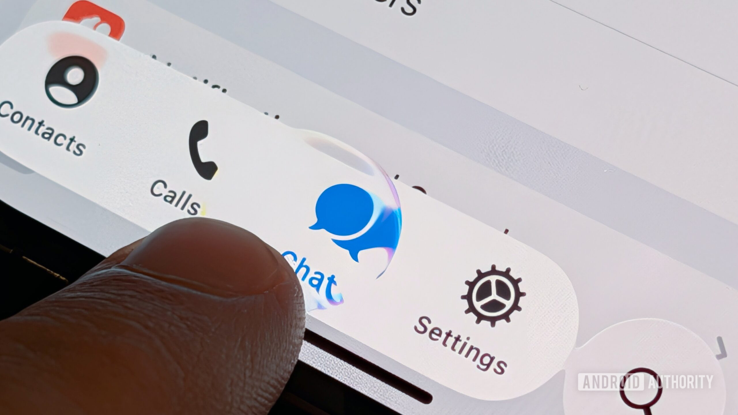
Apple’s Liquid Glass is bleeding into Android — and users can feel the seam
Apple’s systemwide shift to a translucent, motion‑rich interface has reset expectations for app design everywhere. That shift — formally branded as Liquid Glass in iOS 26 and extended across iPadOS, macOS, watchOS, and tvOS — is now showing up in popular Android apps, sometimes verbatim and sometimes as an awkward hybrid layered over Google’s own aesthetic. For users, the result is less a subtle refresh than a visible seam between the operating system and the apps that run on top of it, especially on mid‑range hardware where all that glass has real performance costs.
I see elements of Liquid Glass and a proprietary design system, mixed into one hodgepodge of an app.
Developers are caught in the middle: global product leads want a single visual story; platform owners want consistent behavior; regulators are starting to care about what that means for accessibility and consumer protection.
What Liquid Glass actually changes
Liquid Glass refracts, blurs, and adapts to surrounding content in real time, turning controls, tab bars, and other chrome into a dynamic “material” that recedes behind content and reappears with motion and light effects. Apple pitched it as the company’s broadest visual overhaul in years, spanning first‑party apps and developer APIs. Liquid Glass emphasizes translucency, rounded geometry that echoes device hardware, and layered depth achieved with GPU‑accelerated rendering.
In practice, that means every panel, modal, and navigation element is now a candidate for visual effects that were once reserved for a few showcase screens. When other platforms mimic the look without the underlying system integration — or without tuning for a far wider range of devices — those effects can amplify jitter, input lag, and readability issues. That’s the tension now surfacing on Android.
Material 3 Expressive promised a livelier Android — the rollout is uneven
Google’s Material 3 Expressive is meant to deliver springier physics, updated typography, and richer color theming, while pushing edge‑to‑edge layouts across the OS and first‑party apps. It began surfacing alongside Android 16 and has continued through platform and app updates. Material 3 Expressive is designed to feel native to Android, not iOS‑like — with dynamic color derived from wallpapers, motion calibrated to Android’s navigation model, and components tuned for the platform’s gesture system — but meeting that bar depends on how third‑party developers implement it.
That implementation gap is where design drift begins. Some teams rebuild their Android apps on top of Material 3 primitives, adapting brand shapes and colors into the system language. Others layer Liquid Glass‑style translucency and iOS‑patterned navigation on top of Material 3, creating hybrids that satisfy neither platform’s expectations. The result is a patchwork: two phones on the same Android version can feel radically different depending on how aggressively individual apps chase Apple’s look.
Telegram and Obsidian show how design drift lands on users
Telegram’s latest Android release (v12.4.0) removes the long‑standing hamburger menu, adds a four‑tab bottom bar, and leans hard on translucent panels — a look closely mirroring the app’s iOS build and Apple’s design direction. The redesign is rolling out widely via Google Play, effectively turning millions of Android phones into test beds for a more iOS‑like aesthetic.
Note‑taking app Obsidian recently shipped a mobile UI that adopts floating, circular controls and a bottom bar that reads as iOS‑native. After pushback from Android users — many of whom rely on edge gestures and system navigation muscle memory in dense, text‑heavy workflows — version 1.11.7 added options on mobile to switch off floating navigation and adjust full‑screen behavior.
I feel like I’m using a wanna-be iPhone app on my Android phone.
Neither app is doing anything unusual in strategic terms: both are pursuing a single, cross‑platform design language. But they illustrate the lived cost of that decision. When layout, motion, and translucency are tuned for iOS and then re‑skinned for Android, the friction shows up as missed taps, misfired gestures, and a vague sense that the OS and the app disagree about how a phone should behave.
Design language isn’t just taste — it has platform, performance, and compliance consequences
When Android apps import iOS conventions wholesale, mismatches ripple through navigation, motion, and accessibility. Android users rely on standardized patterns like predictive back gestures, bottom sheets, and edge‑to‑edge layouts with inset protections. Apps that swap in iOS‑style controls without accounting for Android’s system behaviors risk gesture conflicts, occluded content, or poor contrast on busy wallpapers — problems that disproportionately affect older users, people with low vision, and anyone relying on assistive technologies.
The compliance stakes are rising too. Touch target sizes and contrast minimums aren’t optional aesthetics — they’re part of widely adopted standards and, in the European Union, enforceable obligations under the European Accessibility Act, which began to bite for digital services in June 2025. For global apps, that means design decisions made in San Francisco or Dubai can now trigger regulatory risk in Brussels if they make everyday tasks harder for people with disabilities.
Interaction size baselines developers must respect
| Guideline/Standard | Minimum target | Notes |
|---|---|---|
| Apple Human Interface Guidelines (iOS, iPadOS) | 44×44 pt | Maintain adequate padding between controls to support reliable taps. |
| Material Design (Android) | 48×48 dp | 8 dp spacing between targets recommended to reduce accidental touches. |
| WCAG 2.2 (Level AA) | 24×24 CSS px minimum | Or smaller targets with sufficient spacing; Level AAA recommends 44×44 px. |
Contrast and depth effects without accessibility regressions
- Meet or exceed a 4.5:1 text contrast ratio (3:1 for large text) even over blurred or translucent surfaces, especially where text appears over live wallpapers or camera feeds.
- Avoid placing primary actions under system gesture insets when adopting edge‑to‑edge; inset tappable content while letting backgrounds and decorative layers draw behind bars.
Regulatory pressure now matters for consumer apps
- EU enforcement of accessibility rules is no longer theoretical: for in‑scope services, audits increasingly look at real user journeys — such as completing a payment flow or sending a message — rather than only static screens. That raises the bar for teams porting Liquid Glass‑like effects to Android without fully testing them on low‑end devices, assistive modes, or high‑contrast settings.
Android‑first can still be brand‑consistent
Companies that want one visual identity across platforms aren’t boxed into iOS mimicry. Android offers first‑class building blocks — dynamic color, Material 3 components, and predictive back animations — that let teams land a coherent brand while respecting platform norms. Done well, the result feels native on both sides and easier to maintain over time.
For design leaders and policy teams inside large organizations, the question is shifting from “Does this look the same everywhere?” to “Does this behave responsibly everywhere?” That includes whether core flows remain usable with system font scaling, whether navigation respects the host OS, and whether regional legal requirements are met without fragmenting the product. An Android‑first implementation can carry the same typography, iconography, and brand tone as its iOS twin, while still feeling like it belongs on a Pixel, Galaxy, or budget handset.
A practical implementation checklist for teams shipping on Android
- Adopt Material 3 components (Compose or Views) and spring‑based motion; avoid re‑creating iOS control shapes and behaviors instead of configuring the platform primitives you already have.
- Enable edge‑to‑edge, then inset interactive content to avoid status/navigation bar conflicts, especially for primary actions and destructive buttons.
- Support predictive back with AndroidX APIs so system animations and expectations remain intact and users can rely on consistent back‑swipe behavior.
- Honor Android’s 48 dp touch targets and verify a WCAG 2.2 target‑size pass for dense areas such as toolbars, tab bars, and list actions.
- Test contrast over live wallpapers and blurred panels in both light and dark themes using automated checks and manual reviews across at least a low‑end and mid‑range device.
- Expose user‑facing toggles for floating toolbars or anchored navigation when a redesign meaningfully changes muscle memory; give users a migration path rather than a hard cutover.
These are not purely technical chores. For global apps, they now sit at the intersection of design, engineering, legal, and public policy — the same teams that must answer questions from regulators, civil society groups, and corporate boards when an interface change quietly makes core services harder to use.
The line between inspiration and imitation
Design systems cross‑pollinate all the time; translucency and blur are not owned by any one platform. The problem on Android arises when borrowed visuals override the OS’s grammar — gestures, insets, and motion — and the result feels visually slick but operationally foreign. On devices where connectivity is patchy and hardware is constrained, that gap is not just cosmetic; it can be the difference between a service that works for everyone and one that quietly excludes the people who most rely on it.
For apps chasing platform parity, the sustainable path is to translate the brand into Android’s patterns rather than port Apple’s. That keeps users oriented, keeps regulators and accessibility watchdogs at arm’s length, and keeps your app feeling fast and predictable on the full range of Android hardware. Liquid Glass may be Apple’s phrase of the moment, but the real contest now is over who can make modern, animated, glassy interfaces feel native, accountable, and durable across the world’s most widely used mobile platform.
Related reading
